


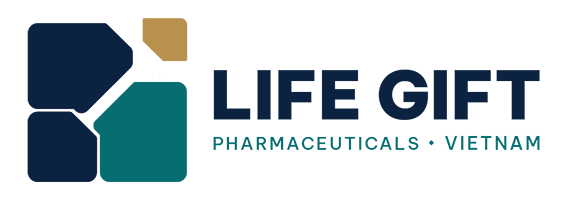
The new brand identity was developed as part of Life Gift Vietnam’s strategy to enhance production capacity, gradually expand from health supplements into the field of traditional medicine, and strengthen the application of science, technology, and innovation in research, production, and business operations.
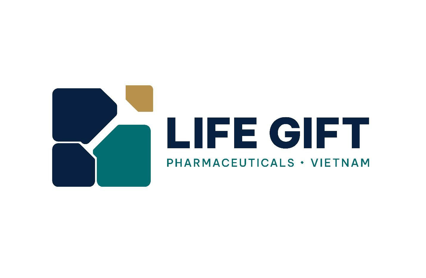
In the pharmaceutical and healthcare sectors, brand identity does more than just help a company stand out. Every visual element must also convey precision, responsibility, and reliability—values directly linked to the processes of research, production, and bringing products to market.
This is also the phase in which Life Gift Vietnam is focused on enhancing its production capacity and gradually expanding from its core strength in health supplements into the field of traditional medicine. This process places higher demands on research, quality management, production organization, and business operations.
Therefore, the new branding system is not merely a visual change but also reflects a shift in Life Gift Vietnam’s development strategy: grounded in science, guided by standards, and focused on sustainable values for health and life.

Four building blocks, four core competencies
At the heart of the new brand identity is a logo composed of four rounded geometric shapes, representing the four core competencies: research and development; quality management; production and operations; and customer and market engagement.
The blocks vary in shape, proportion, and position, yet they are interconnected within a unified structure. This organizational approach reflects a sequence of interrelated activities, in which each component plays a distinct role but all contribute to the common goal of creating a high-quality product with practical value.
Instead of using familiar images such as a pill, a leaf, or a medical cross, the language selection icon is abstract and minimalist. This design approach gives the brand identity a distinct character while aligning with the goal of building the image of a modern pharmaceutical company.
The Y-shaped space in the center serves as a connecting axis. It is both the convergence point of the four capabilities and represents the journey of transforming scientific ideas into products with market value.
Positioned prominently above the overall structure, the champagne-yellow block symbolizes a spirit of breaking new ground and the aspiration to transcend existing limits. This detail reflects a mindset that is not confined by conventional frameworks, operating methods, or fixed market boundaries; it also demonstrates a proactive approach to innovation and the ability to adapt to technological advancements, including artificial intelligence (AI).
The size of the yellow block has been carefully scaled to create a focal point without overwhelming the overall structure. As a result, the logo retains a sense of stability while evoking an upward motion and a spirit of moving forward.
Each color plays a role

The new branding system uses three primary colors: navy blue, teal, and champagne yellow.
Navy blue represents trust, discipline, and a foundation of quality. The repetition of two blocks in the same navy blue is a deliberate design choice intended to create a visual anchor, uniting the elements into a solid and unified whole. Teal evokes associations with science, health, and a spirit of innovation. Champagne gold symbolizes achievement, sophistication, and a drive for growth. The white space at the center serves not only as a design element but also symbolizes transparency and integrity in business operations.
This combination aims to create a professional yet approachable image, embodying a spirit of science and technology while maintaining a sense of warmth. In practical applications, navy blue and teal form a stable, recognizable foundation; champagne gold is used sparingly in areas that need to be emphasized.
“We do not view the logo redesign as a mere cosmetic refresh. What is more important is building a visual identity system that can be used long-term and more clearly reflects Life Gift Vietnam’s capabilities and development direction. The new system is expected to help customers and partners recognize the brand more clearly and consistently at every touchpoint,” said Mr. Kan Quoc Thanh, Head of Creative Design at Life Gift Vietnam.
From the logo to a unified brand identity system
Along with the new logo, Life Gift Vietnam has developed logo versions tailored to specific usage contexts. The horizontal version is preferred for signage, documents, websites, and other wide-format materials; the square version is suitable for profile pictures, small labels, or surfaces with limited space.
The single-color and negative variants have also been standardized to ensure legibility when printed, engraved, or displayed on a dark background. The four-block visual language has been further developed into patterns for stationery, uniforms, packaging, work equipment, and corporate spaces.

This approach allows the brand identity system to be flexible without relying on the repetition of the logo in every location. When the proportions, safe zones, colors, and placement of the logo are applied consistently, the brand becomes more recognizable, while also preventing each document or publication from using a different presentation style.
A New Image, Continuing Our Values
Life Gift Vietnam operates in the fields of research, manufacturing, and custom processing of health foods, dietary supplements, and traditional medicines. As the company expands its operations and gradually enhances its production capacity, the new brand identity is seen as the foundation for ensuring that its external image keeps pace with the internal changes within the company.
The transition is being implemented according to a phased plan covering corporate materials, digital platforms, workspaces, packaging, and branding items. The phased approach ensures consistency while minimizing waste of items that still have usable value.
A new logo may make a strong first impression, but brand reputation must still be earned through product quality, operational capabilities, transparency in partnerships, and a consistent experience for customers and partners.
Therefore, the rebranding is considered the starting point for the process of standardizing the brand image. The value of this change will become more apparent once the new system is implemented consistently and goes hand in hand with substantive changes in Life Gift Vietnam’s operations.
LIFE GIFT VIETNAM PHARMACEUTICAL CO., LTD.
Life Gift Vietnam is a pharmaceutical company specializing in the production of traditional medicines and health supplements. With a state-of-the-art manufacturing facility that meets GMP requirements and implements the ISO 22000:2018 food safety management system, Life Gift maintains comprehensive control over the entire process—from raw materials to finished products—with the goal of providing products of consistent quality that meet the needs of its partners and the market.
Address: Lot A3, Cau Tram Industrial Park, Rach Kien Commune, Tay Ninh Province, Vietnam.
Phone: 0272 372 3486
Email: info@lifegiftvietnam.com
Website: lifegiftvietnam.com
Related Posts