



With a logo composed of four interconnected geometric shapes, Life Gift Vietnam has finalized its new brand identity to better reflect the pharmaceutical company’s core activities: research, quality management, manufacturing, and market engagement.
Life Gift Vietnam’s new brand identity features three primary colors: navy blue, turquoise, and champagne gold.
In the pharmaceutical and healthcare sectors, an effective brand identity does more than just help a business stand out. A brand’s image must also evoke precision, responsibility, and reliability—qualities directly tied to how the business conducts research, manufactures products, and supports its customers and partners. With this in mind, Life Gift Vietnam chose to redesign its logo as a way to redefine its visual language, making the brand clearer, more modern, and more consistent.
One symbol, four core activities
The centerpiece of the new brand identity is a logo consisting of four rounded geometric blocks. Each block represents a key activity in the product development process: research and development; quality management; production organization; and market engagement. The blocks have different shapes and proportions but are all oriented toward a common structure, reflecting the spirit of collaboration among various departments rather than existing as separate, disconnected links.
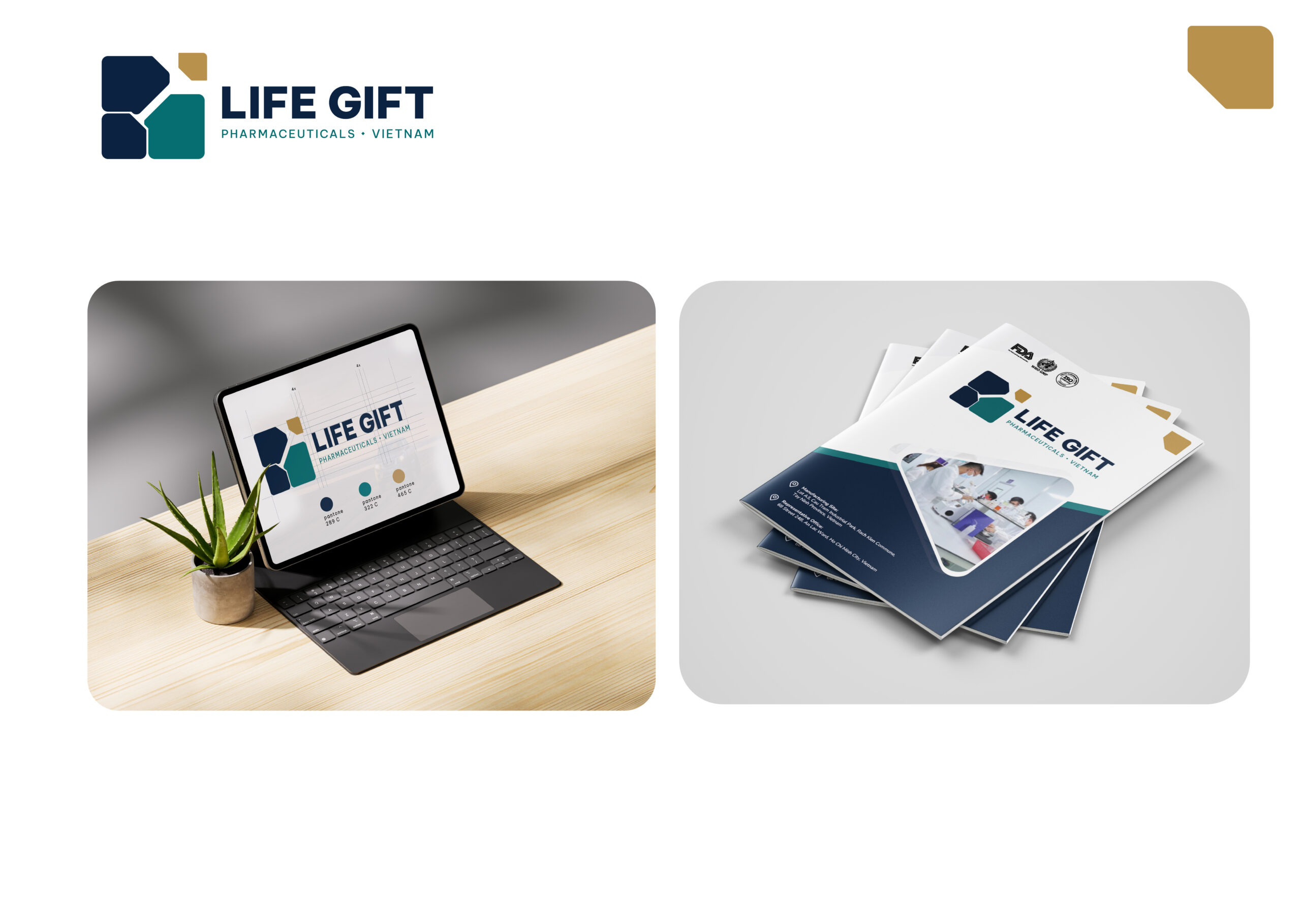
Instead of using direct illustrations such as a pill, a leaf, or a medical cross, the logo employs abstract and minimalist design. The white space at the center forms a connecting line that evokes the shape of the letter Y: it serves as both a focal point and opens up multiple directions for development. This detail lends the overall design an airy quality while conveying the concept of the connection between scientific knowledge, work processes, and the practical needs of the market.
The small gold block positioned at the top creates an upward rhythm. This focal point symbolizes innovation, achievement, and the aspiration to break new ground. Its size is kept modest so that the gold color draws the eye without detracting from the overall stability of the logo.
Color balances science and emotion
The new color palette is built around three primary shades. Navy blue plays a dominant role, evoking associations with trust, discipline, and the standards required in the pharmaceutical industry. Emerald green adds a sense of health, science, and innovation, while champagne gold highlights quality, achievement, and the aspiration for growth. White is used extensively to maintain clarity and transparency and to give the color scheme breathing room.
This combination aims to create a professional yet warm image—one that is tech-forward while maintaining a sense of approachability. In the app, navy blue and turquoise form a stable, recognizable foundation; yellow appears only in areas that need to be emphasized, thereby establishing a clear visual hierarchy.

“The rebranding is not intended to change the values that Life Gift Vietnam has established, but rather to help the brand image more clearly reflect how the company operates: with science, quality, and a spirit of collaboration as its foundation. “We expect the new system to help customers and partners recognize Life Gift Vietnam more clearly and consistently at every touchpoint,” said Mr. Kan Quoc Thanh, Head of Creative Design at Life Gift Vietnam.
From the logo to a unified brand identity system
Along with the icon, Life Gift Vietnam has developed logo versions tailored to specific usage contexts. The horizontal version is recommended for signage, text headers, websites, and other wide-format materials; the square version is suitable for profile pictures, small labels, or surfaces with limited space. Single-color and negative variants have been standardized to ensure recognizability when printed, engraved, or placed on dark backgrounds.
The four-block visual language can also be developed into distinctive patterns for notebooks, pens, mugs, uniforms, work equipment, packaging, and office spaces. On large wall surfaces, individual blocks are enlarged, elongated, or arranged in a rhythmic pattern; the yellow color is used solely as a visual anchor. This approach allows the system to remain flexible without relying on repeating the logo in every location.
The value of a brand identity, therefore, lies not in a single symbol, but in the ability to maintain the same spirit across multiple touchpoints. When proportions, safe distances, colors, and logo placement are applied consistently, the brand becomes more recognizable, while also reducing the likelihood of each publication using a different presentation style.
A New Image, Continuing Our Values
Life Gift Vietnam operates in the field of research, manufacturing, and custom processing of health products, dietary supplements, and traditional medicines. As the company expands its partnerships and professionalizes its operations, the new brand identity system is seen as the foundation for ensuring its external image keeps pace with the internal changes within the organization.
The changes will be rolled out according to a phased plan across corporate materials, digital platforms, workspaces, packaging, and branding items. This phased approach helps ensure consistency while minimizing waste by avoiding the replacement of items that still have usable value.
A new logo may make a strong first impression, but brand credibility must still be proven through product quality, transparency in partnerships, and a consistent customer experience. With its concise structure, restrained color palette, and adaptability across multiple formats, the new brand identity is expected to help Life Gift Vietnam tell its story more clearly—through modern, scientific imagery with a long-term vision.
INFORMATION
Life Gift Vietnam | info@lifegiftvietnam.com | lifegiftvietnam.com
Related Posts